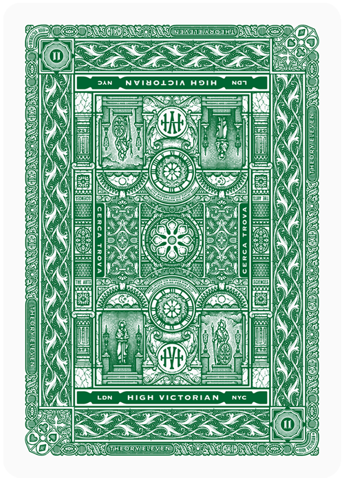
High Victorian Playing Cards for Theory11
Packaging design, custom illustration, card design, typography, pattern work
The Concept
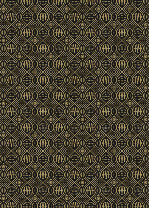
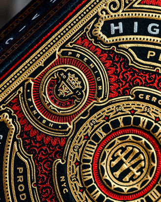
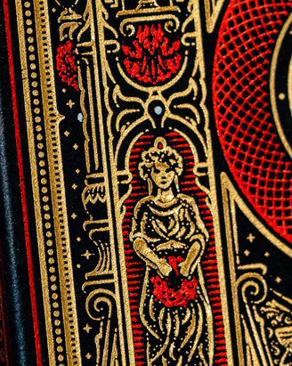
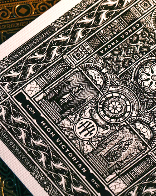
Inspired by Victorian architecture, this project combines historical references with my own engraved, label-style approach. The focus was on building a system of detailed typography, small-scale illustration, and repeating patterns.
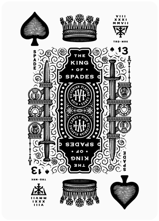
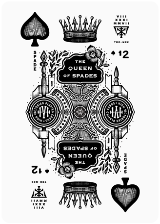
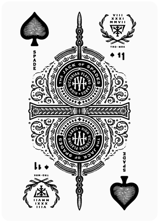
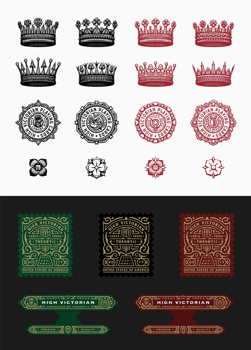
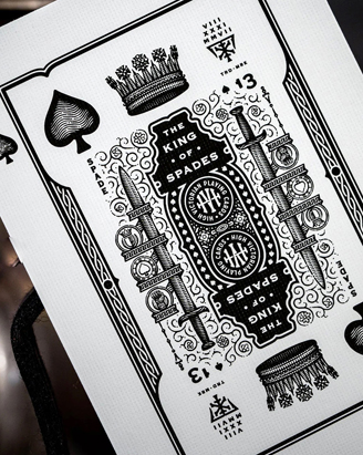
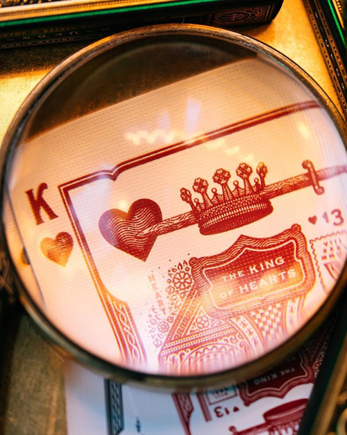
Rather than the traditional royal figures, I reimagined the court cards as compositions built from their symbolic elements - crowns, weapons, and botanical motifs.
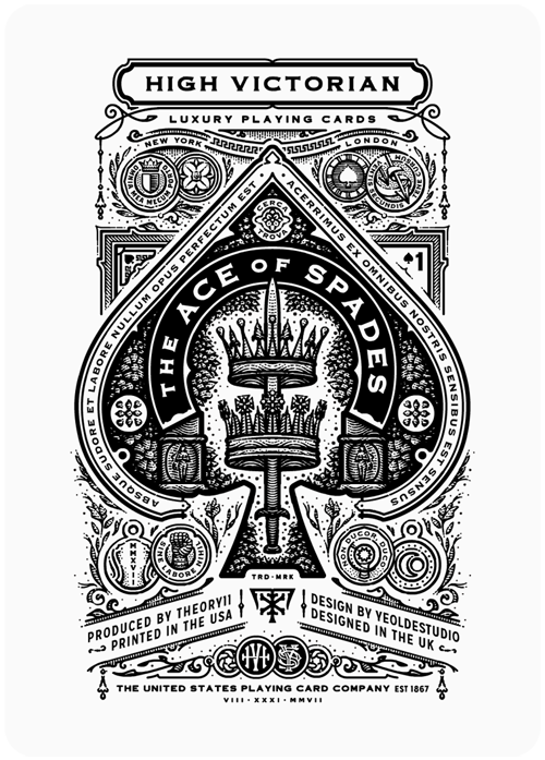
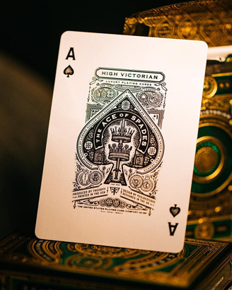
Each Ace was designed as a self-contained structure, following a shared visual language but tailored to the shape and symbolism of its suit.
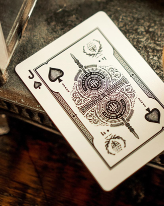
Designed to reward close inspection, the deck features subtle nods to classic card-making lore, from the ‘suicide king’ and one-eyed jacks to the recreation of each queen’s traditional flower.
This approach preserves the hierarchy and spirit of classic decks while aligning with my own engraved, ornamental style.
The Project
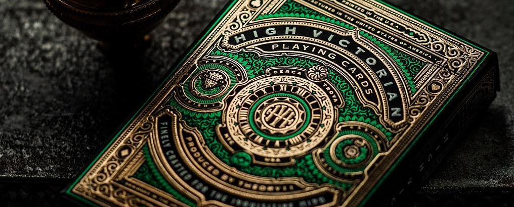
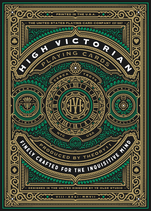
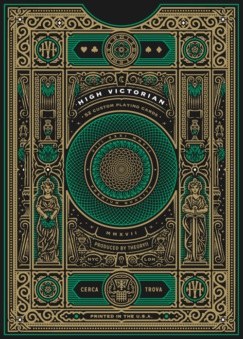
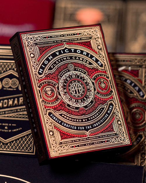
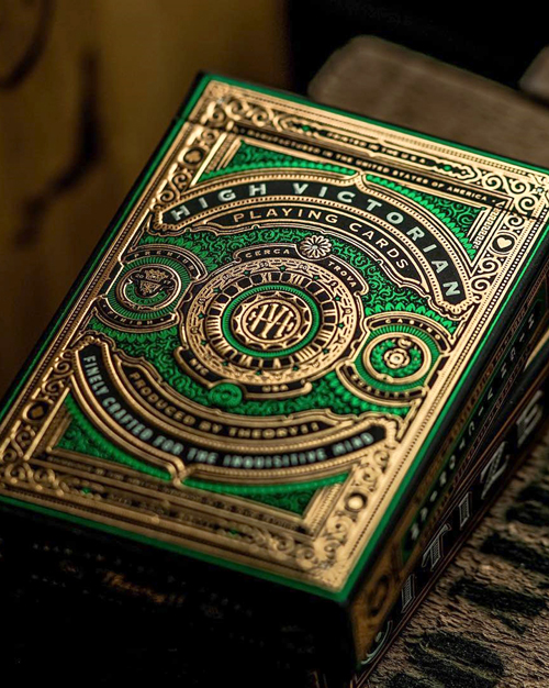
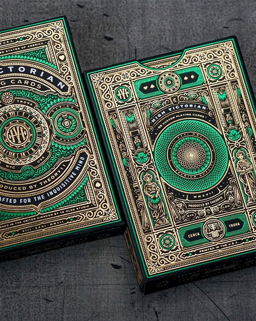
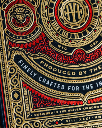
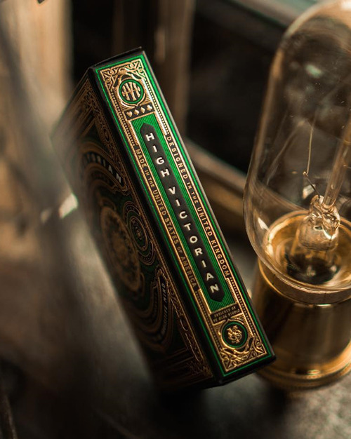
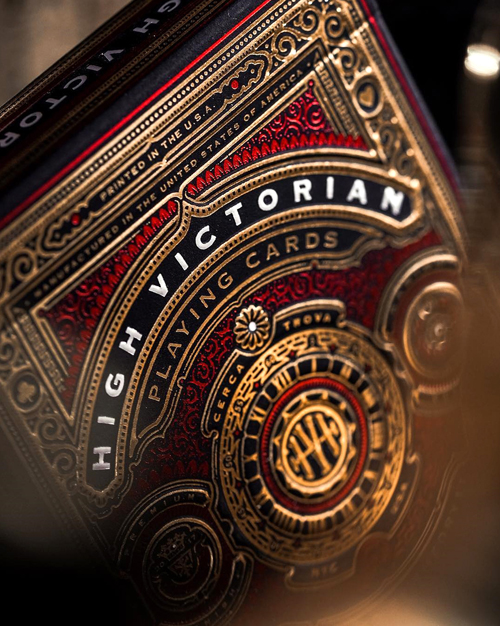
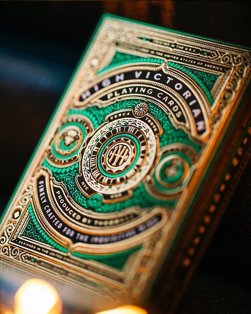
I collaborated with Theory11 to design an original deck of playing cards featuring fully custom artwork across every detail, including court card illustration, Ace of Spades, and tuck box design.
The initial release was produced in green and gold foil, while a red foil edition was later adopted as an exclusive by Target stores across the U.S.
The artwork was carefully engineered for foil stamping, allowing the intricate lines to retain their clarity even at small sizes.